Date: May 2015
Client: Sling TV
Categories: UI Design, Interaction, Whiteboard
The following example is an excellent illustration of the step-by-step process of uncovering the best interface/interaction for the business objective.
Objective: Add more base packs with the ability to feature specific packages.
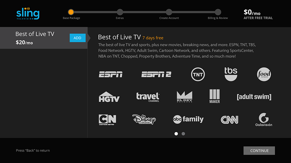
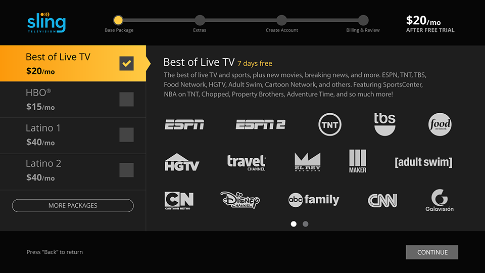
We had a signup process in place, as seen in the first image. There was only one base package to begin with, the "Best of Live TV." The business had negotiated a deal with HBO to include a premium package. We also had around 20 language packages, the top priority being the 2 latino packages. We wanted to prioritize HBO, and the 2 latino packages but also let users know there were more language packages available.
Step One
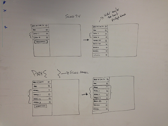
The first thing we did is walk to the whiteboard to quickly sketch out our first impressions. The lead designer began by showing me what he had in mind based on existing patterns. I agreed with his approach and made a couple small suggestions. We quickly came to an agreement and I took the whiteboard sketch to Illustrator. (We were using Adobe at the time.)
Step Two
The whiteboard exercise revealed two new patterns we hadn't used before, loading more content and expanding lists. My job was to find a UI solution for these new patterns. Instead of showing a list of 20 base packages I decided to only show the 4 prioritized packs and reveal the rest with a "more" button. What should this button look like?
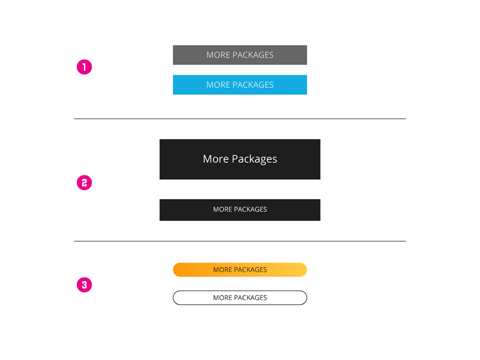
The existing button style was too prominent and too similar to the old method of selecting packages. The second option I tried was more subtle but I felt it was too different from all our other UI conventions and the black background conflicted with the black header and footer.
Next, I tried a short, rounded button that resembles a toggle. The toggle pattern is often used to reveal content. The yellow fill was too bright and competed with the selected state of the package. The outlined button was different and yet appropriate. Noticable but still subtle.
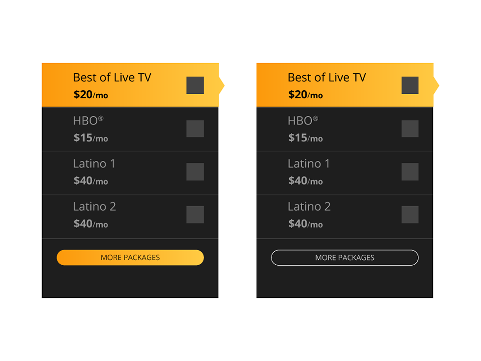
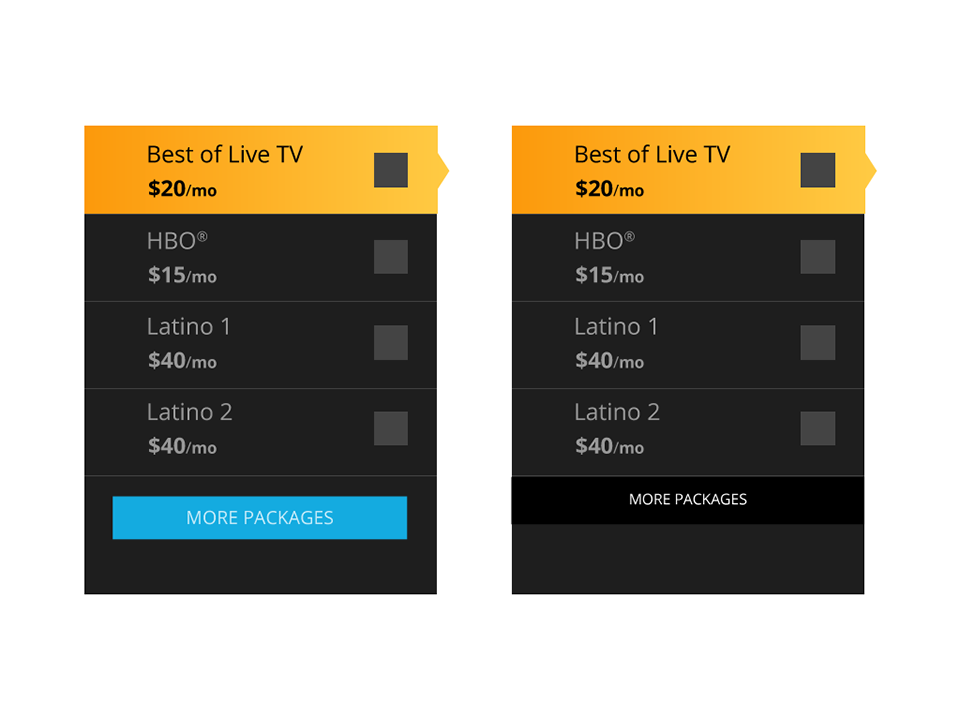
Here is the "more" button pattern when placed on the signup page.
Step Three
But we're not done! We still need to develop the second new pattern, expanding lists. We were going to offer about 20 base packages in about a dozen different languages. The logical solution was to show languages first. Once a user scanned the list and found the desired language, they could see the options available for that language.
I removed the price and added standard arrow icons. I added double lines at the bottom of the cell in order to suggest stacking, or more content. Language focus is grey rather than yellow to not suggest a selection can be made.
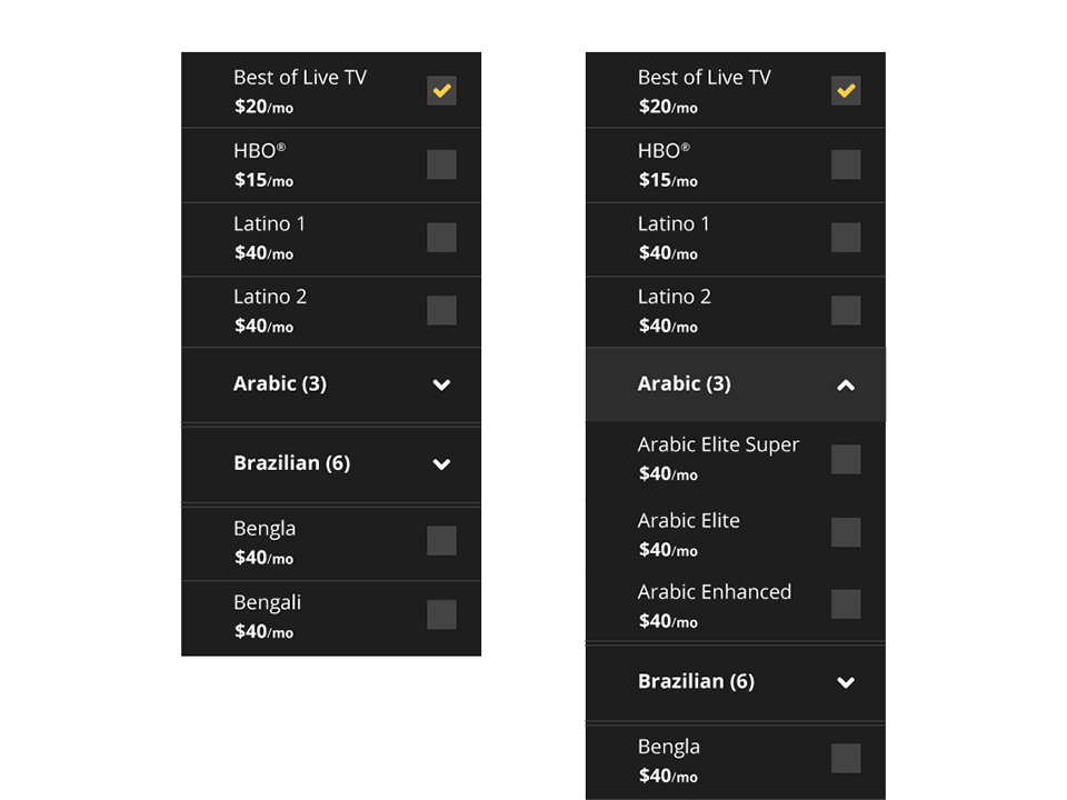
After some self analysis, I determined that the double lines are not prominent enough. I replaced them with a thicker, solid line. The package grouping is not clear enough. The grey focus background is applied to the whole group. I removed parenthesis indicator. Users don't need to know how many channels are in a group. The language titles are changed to all caps for further differentiation.
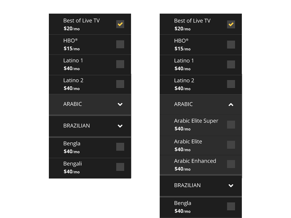
After further analysis with another designer, we decided the group needed to be more apparent. I added a vertical yellow line to unify the group. Language returns to lower case and focus state on the title includes yellow text.
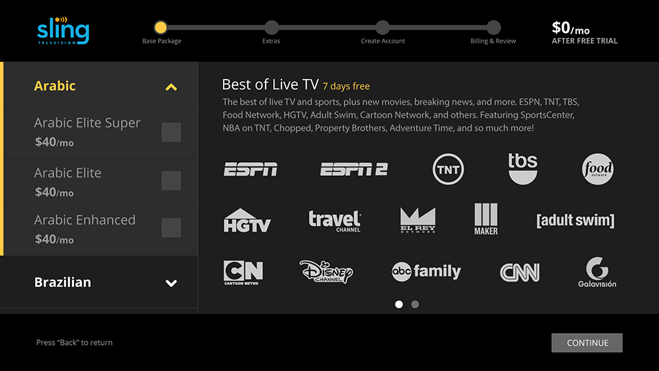
The final design solution satisfied the business objectives and was accepted unanimously by the stake holders.
